
Simpson's Paradox: When the Trend Reverses Once You Stratify
Simpson's Paradox is the statistical illusion that occurs when you forget about granularity. The data shows a clear trend in one direction. You split it into groups, and every single group shows the trend going the other way. The aggregate and the strata point in opposite directions, and there is no contradiction. Both views are correct. They are just answering different questions.
The cleanest illustration is also the one that sticks. Look at this scatterplot.
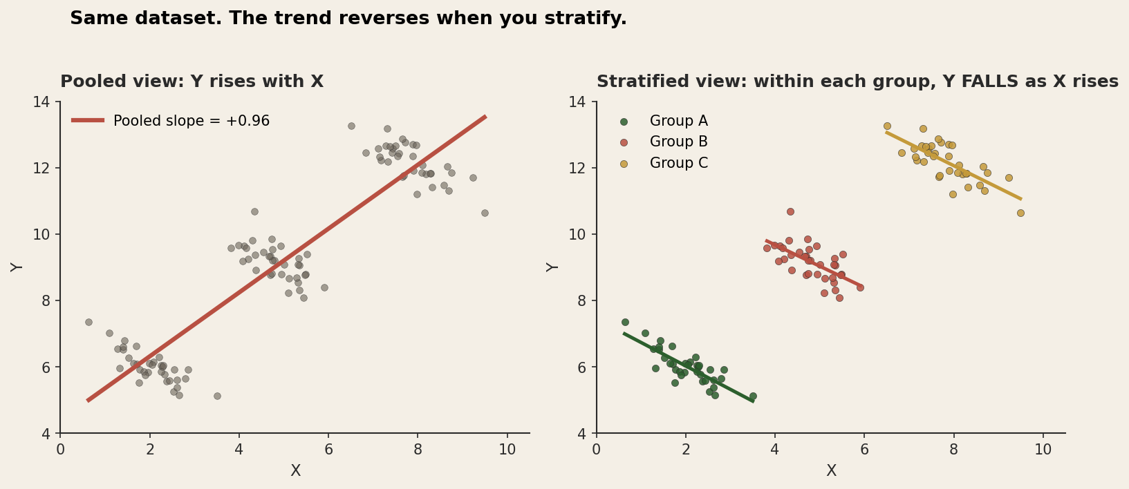
The pooled regression slope is +0.96. Y goes up as X goes up. Split the same points into their groups and the slope flips to about −0.8 inside each one. Now Y goes down as X goes up. Both numbers are right. The pooled slope is computed correctly from the pooled data, and the within-group slopes are computed correctly within each group. Nothing is broken.
What's going on is a staircase. Group A sits low and to the left, group C sits high and to the right, and the climb from one group to the next runs upward. That between-group climb is what the pooled regression sees. It has no idea the groups exist, so it fits one line to everything, and that line follows the staircase rather than the slope inside any single step. The structure is right there in the data. The aggregate just throws it away.
Berkeley, 1973
The most famous version of this occurred in the 1973 graduate admissions data at UC Berkeley. The university had admitted 44 percent of male applicants and 35 percent of female applicants. A 9-point gap, significant beyond any reasonable doubt, and the university was sued for sex discrimination.
The case became famous because the statistical defence held up. Bickel, Hammel, and O'Connell published a paper in Science in 1975 that walked through the data department by department. The aggregate gap, they showed, was an artefact of how men and women sorted themselves across departments, not evidence of different treatment within them.
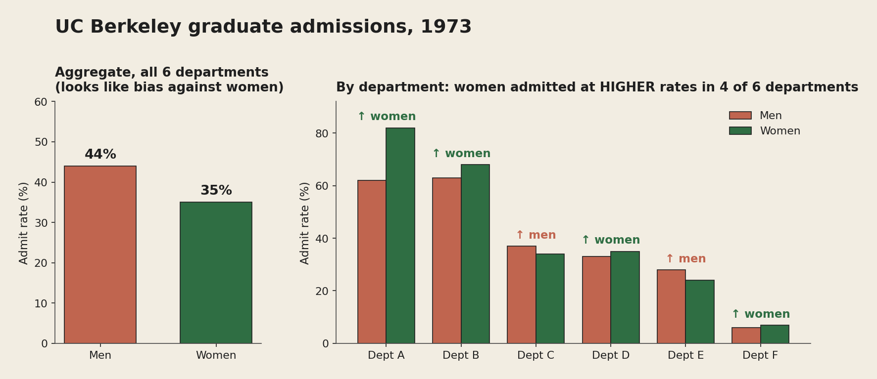
In four of the six departments, women were admitted at a higher rate than men. In the other two the gap was small. So why did the aggregate lean the other way? Because women were applying, disproportionately, to the departments that were hard to get into for everyone. Department A admitted roughly two-thirds of its applicants and was almost all men. Department F admitted around 6 percent of its applicants and drew a much higher share of women. The aggregate "men get in more" was never a fact about how any department judged its applicants. It was a fact about which departments people applied to.
The Bickel paper is one of the great pieces of applied statistics, partly because it is careful about what it does not show. The conclusion is not "Berkeley was not discriminating." It is narrower: the aggregate gap is fully explained by departmental application patterns, so if there is a cause that needs explaining, it sits upstream of admissions. Why were women applying disproportionately to the harder departments? That is a real question. It is just a different one than the aggregate seemed to be answering.
The geological version
If you have spent any time with province-wide compilations of geochemical or alteration data, you have seen this shape already. Picture a dataset of mineralised samples across a province with two columns: alteration intensity (a composite of all the things alteration does to a rock) and gold-equivalent grade. Pool the whole thing, run a regression, and you will probably find that more alteration goes with higher grade. That makes geological sense. Mineralisation is fluid-driven, fluids alter rocks, alteration intensity stands in for fluid flux, and fluid flux stands in for grade. Tidy story.
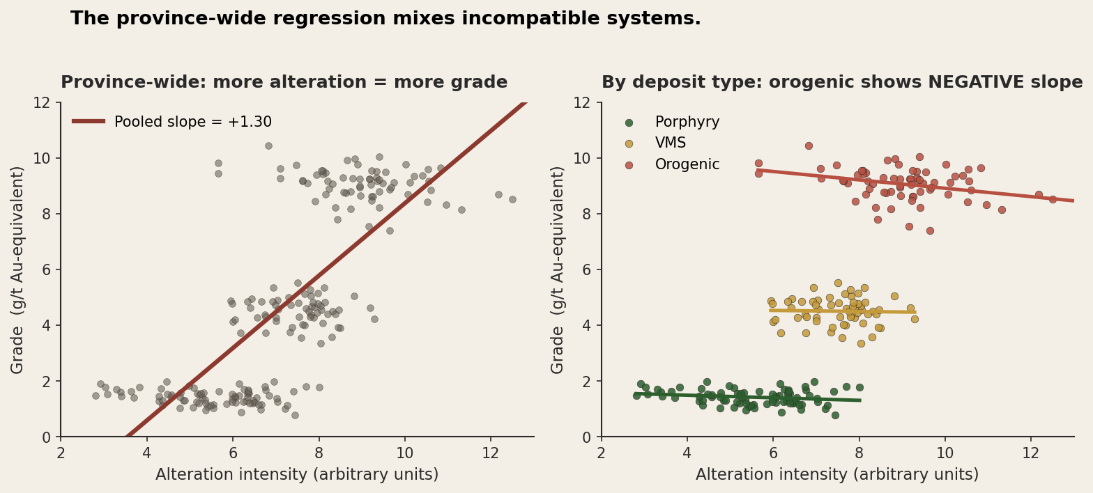
Now break it down by deposit type, and the tidy story comes apart. Porphyry samples cluster at moderate alteration and low grade, with a flat or weakly negative slope. VMS samples cluster at moderate alteration and moderate grade, roughly flat. Orogenic samples sit at high alteration and high grade, with a distinctly negative within-type slope: once you are inside an orogenic system, more alteration often means less grade, because the most intensely altered zones are frequently the most leached. The pooled slope is positive because the three deposit types form an upward staircase, not because alteration drives grade inside any one of them.
Take that province-wide regression to a prospectivity decision and it tells you "find me ground with more alteration." So you point your programs at the most altered rock in every system, including the orogenic ones, where you should be looking at the moderately altered parts instead. The aggregate model is not lying to you. It is answering one question, what does alteration correlate with across this province, when you wanted the answer to another, what does alteration tell me about grade within this deposit type.
The same shape turns up in lab-versus-lab comparisons, where pooling hides systematic between-lab biases, and in grade-control assays pooled across mining areas with different local trends. More generally, it shows up in any "x versus y" compilation drawn from sources that don't belong together, which is to say almost every compilation that exists.
Why this is harder to fix than it looks
The first instinct is "always stratify." But that can't be the rule, because stratifying only helps if you split on the right variable. In the Berkeley case the right variable was department, because departments were where the decisions got made. In the geology case it was deposit type, because that is where the alteration-grade relationship is internally consistent. Split on the wrong variable and you can manufacture, or erase, a Simpson reversal at will.
That is the deeper issue. Whether the aggregate or the strata answer your question correctly depends entirely on the question. Want the average admission probability for a male versus a female applicant to Berkeley? The aggregate is right. Want to know whether department X treats applicants differently by sex? The strata are right. The same data serves both, and the answers point opposite ways because they are different questions. Calling one of them the "real" answer and the other a "paradox" misses the point.
The version that bites in causal inference is knowing which variables to control for. Adjusting for department in the Berkeley case "explains away" the apparent discrimination, but only because the application patterns are themselves part of the thing being studied. Adjusting for deposit type in the geology case is sound, because deposit type is upstream of the alteration-grade relationship. But adjust for a variable that sits downstream of your effect and you can introduce a reversal that was never there, a trap that goes by "collider bias" or "Berkson's paradox" depending on the flavour (the latter being an earlier post in this series). Deciding what to stratify on is not a statistical choice. It is a causal one, and it needs a model of the world that the numbers alone can't give you.
Where this hides in machine learning
In ML, the version to worry about is the gap between marginal and conditional feature importance. A feature can look strongly predictive in the aggregate and be useless inside every subgroup that matters. It can also look weak in the aggregate and be the most important feature inside the subgroups, if the subgroups themselves differ. Permutation importance, SHAP, and most other interpretability tools report marginal importances by default. They can't tell you whether the importance you are reading is doing real work within homogeneous strata or is just inherited from between-stratum structure that was there before your model arrived.
The classic example is age in a medical model. A drug looks effective on average. Split by age, though, and it helps the young and harms the old; the population just happens to skew young, so the harm hides inside the mean. The within-group split is the only thing the clinician can use, and the aggregate hides the most important fact about the drug.
The geological version is the model that scores well on a held-out sample from the same provinces it trained on, then falls apart on a new terrane. Sometimes that is survivorship bias (an earlier post in this series). Often it is also Simpson's: the model learned the between-province pattern instead of the within-province one, and only the within-province pattern travels to new ground where the between-province context is different.
What to actually do
Plot every stratum you can think of. Before you trust an aggregate regression, colour the points by every reasonable grouping variable you have and look at the within-group slopes. If they all match the aggregate, you can probably trust it. If any of them reverse, the aggregate is mixing populations.
Ask which question the aggregate is answering. Aggregates answer marginal questions ("what is the average rate across the whole population?"). Strata answer conditional ones ("what is the rate inside this subgroup?"). Most decisions you actually make are conditional. Don't reach for a marginal answer when you need a conditional one.
Stratify on causes, not consequences. The right variables to split on are the ones that make the decisions or generate the data within their stratum. Department is right for Berkeley because that is where admissions happen. Deposit type is right for the geology because the process constrains the chemistry and the alteration. Split on something downstream of the relationship you care about and you can add more bias than you remove.
For models, look at performance within strata. A model with a great aggregate AUC can be quietly terrible inside the subgroups. If those subgroups are where the model will actually be deployed, the within-subgroup score is the only one that counts.
Expect both views to have something to say. Simpson's Paradox is not "the aggregate is wrong and the strata are right." It is "the two are answering different questions, and the right one depends on the decision in front of you." Knowing which is which is the whole skill.
Berkeley became famous because it had a satisfying twist. The duller, more useful point underneath it is this: averaging over heterogeneity hides whatever the heterogeneity was doing. An aggregate gives every observation equal weight and ignores all the structure those observations carry. Most of the time the structure matters. Sometimes the aggregate is exactly the wrong way to look at the data, and you cannot tell from the aggregate alone whether you are in that case. The only way to find out is to look at the strata.
This post is part of a series on statistical pitfalls in geoscience, drawn from a talk given at GACMAC 2026.