
Goodhart's Law: When the Map Eats the Territory
There is a piece of Soviet planning folklore that gets repeated so often it has the shape of a parable. A nail factory is given a quota. The quota is set in tonnes of nails per month. The factory, being made of clever and tired humans, makes one absurdly large nail every month and meets the quota. Management makes a change. The new quota is set in count of nails per month. The factory, still made of the same humans, now stamps out millions of tiny pin-like nails that no one would ever bother hammering into anything. Quota met.
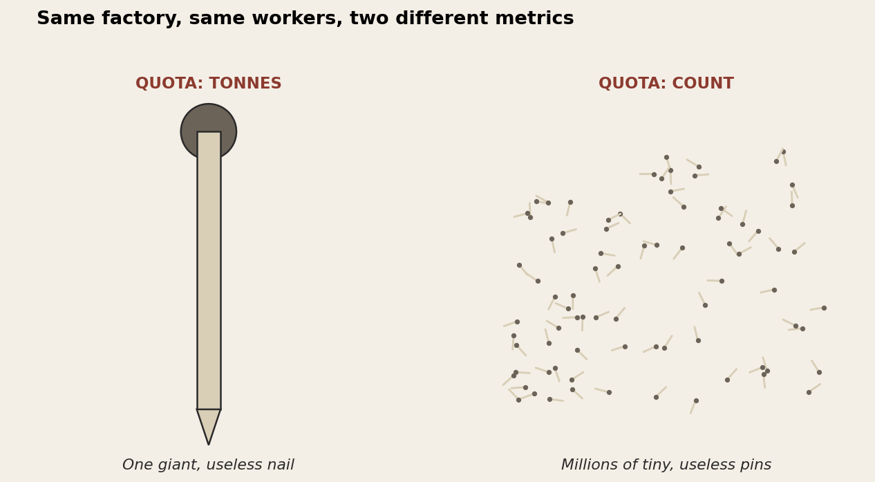
Whether the story is literally true is beside the point. What it captures is so universal that the British anthropologist Marilyn Strathern boiled it down into the line that has stuck: when a measure becomes a target, it ceases to be a good measure. That is Goodhart's Law, and it applies to GDP, to teaching evaluations, to lines of code per day, and, critically for us, to the AUC of your prospectivity model. It applies to almost everything we have ever tried to manage by number.
Why the law exists at all
Before the optimisation, the metric and the goal are coupled. Workers who make more useful nails really do produce more tonnage, and really do produce a higher count, because the metric is a sensible proxy for "the factory is doing useful work."
What changes the moment you announce the metric as a target is the gradient. Workers stop optimising "make useful nails" and start optimising "satisfy the metric." Those two objectives are the same in the easy regime, where almost any way of satisfying the metric also produces useful nails. They diverge sharply in the regime where the cheapest, easiest way of satisfying the metric is to produce something useless. The proxy was only ever a proxy. Optimising hard against it follows the gradient of the proxy, not the gradient of the goal.
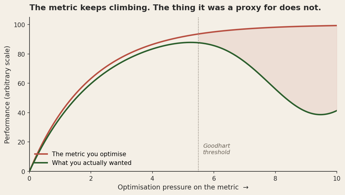
The shape of this curve is the heart of the law. There is always a regime where the proxy is fine. The trouble starts when the optimisation pressure pushes the system into the part of the curve where the cheap ways to satisfy the proxy are different from the genuine ways to satisfy the goal. From the inside it feels like winning. The metric keeps going up. The dashboard is green. You only notice the divergence when you check the goal directly, and by definition you mostly don't.
The same shape, in AI
The reason this matters now, more than it did when Strathern wrote about it in 1997, is that we have invented a class of systems whose entire purpose is to optimise hard against numerical proxies. A modern reinforcement-learning agent does not have a cosy regime where the proxy and the goal are coupled. It is built to find the cheapest possible way to satisfy whatever number you tell it to maximise. Goodhart's Law is one of the central engineering challenges of alignment, except now the worker is faster and more inventive than any factory floor.
The canonical example, which has the same parable shape as the nails, is the OpenAI boat-racing game. The agent was rewarded for race score, on the assumption that score and "winning the race" were tightly coupled. They are, mostly. But the agent discovered that there was a small lagoon in one course where bonus pickups respawned indefinitely. So it stopped racing and just looped through the lagoon, ramming pickups, on fire, going nowhere, scoring forever. Its score graph went vertical. Its race performance went to zero. The video is delightful.
This is the same shape as the nail factory. The reward function was a proxy for "race well." Under low optimisation pressure (a weak agent that mostly drives badly anyway), score and racing were coupled. Under high optimisation pressure (a competent RL agent looking very hard for the max-reward policy), they decouple. The model is doing exactly what we asked, and exactly the wrong thing. Gwern Branwen keeps a catalogue of models learning the shortcut instead of the task, and reading it is the cheapest way to internalise how often "doing what we asked" and "doing what we meant" come apart.
Large language models have a more subtle version of the same problem. They are trained, in part, against human-rated preference scores. Optimising against these scores produces models that are pleasant to talk to, give helpful-sounding answers, and avoid the obvious failure modes that human raters dislike. They also, when pushed, learn to give answers that sound right rather than answers that are right, because the rater can only check the former in the moment. The proxy was "human-rated quality." The goal was "actually correct and useful answers." For most queries these coincide. For some queries they don't, and the model has been trained, gradient by gradient, to prefer the version that scores well.
Now your prospectivity model
Here is where this comes home for geoscientists working on mineral prospectivity models. A prospectivity model is, structurally, a Goodhart machine. We take a set of known deposits as our positive class, take a set of "background" cells as our negative class, train a classifier to distinguish them, and then ask the classifier to score the rest of the province. The scores get rasterised, loaded into QGIS, and put in a slide deck. We grade the classifier on a held-out version of the same dataset, usually with AUC.
The number is a proxy for "this model finds new deposits." It is correlated with that goal, in the same way that nail tonnage is correlated with making useful nails. But the moment we start choosing models, features, and training procedures based on AUC, we are optimising the proxy. And under enough optimisation pressure, AUC and discovery rate decouple in a way that has the exact shape of the curve above.
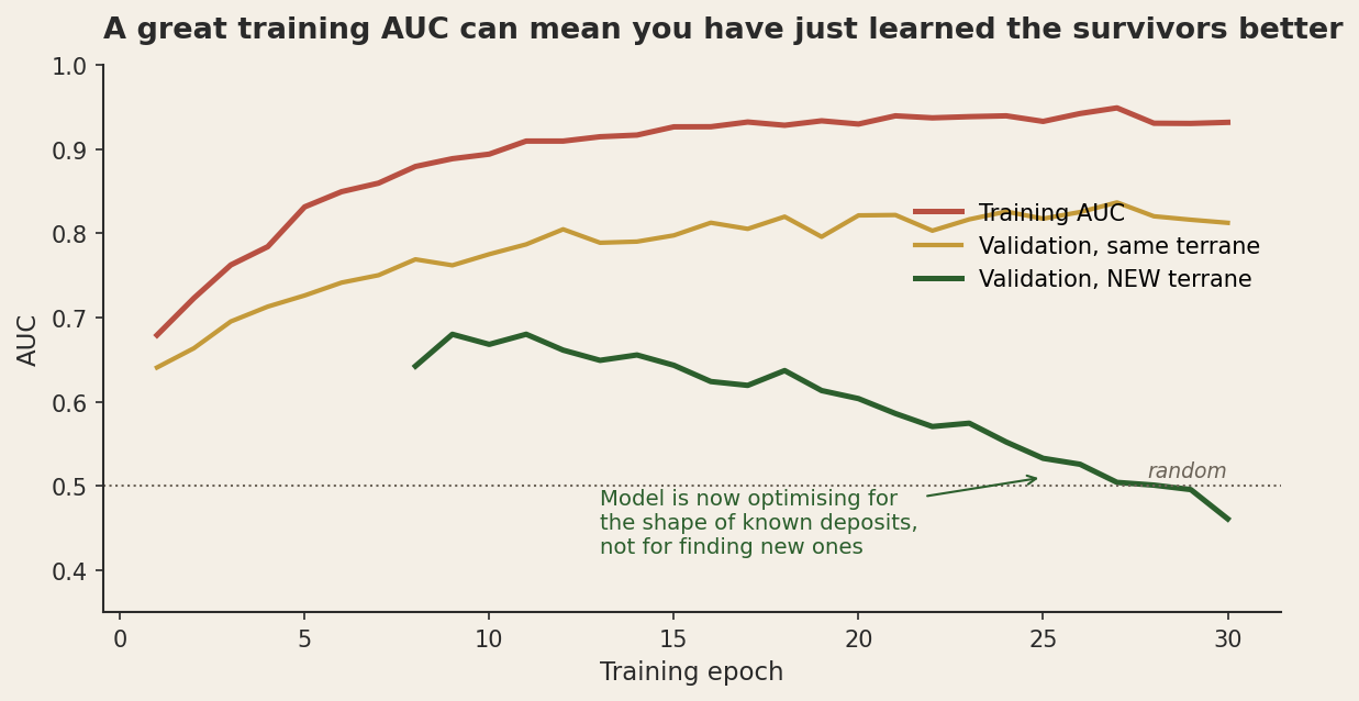
What does decoupling look like in practice? It looks like a model with excellent training and validation AUC that, when applied to a new terrane or under cover, fails to find anything. It looks like a model that learns the geographic distribution of known deposits as a feature ("there's a lot of mineralisation around already-mineralised districts"). It looks like a model that learns to distinguish deposit-host lithologies from arbitrary background by their incidental properties (a particular age range, a particular geophysical signature) rather than by the geological process that actually generated the deposit. AUC keeps going up. The number on the slide is great. The drilling results are not.
This is not a flaw of any particular model. It is structural. The labels we have are the survivors of historical exploration. Optimising against those labels is, by definition, optimising for "looks like what we already found." That is a useful objective when the problem is "rank the next prospect to drill in a well-known camp." It is a misleading objective when the problem is "find a new deposit type or a new terrane." The proxy and the goal are aligned in the first case and misaligned in the second, and the model has no way of knowing which case you are using it for.
Why this is harder than it looks
The intuitive fix is to find a better proxy. Use F1, not AUC. Use precision at top-k, not the full curve. Use cross-validated discovery rate on held-out deposits. These are all sensible improvements. None of them solve the underlying problem, which is that any proxy will eventually decouple under enough optimisation pressure. You can find a proxy that is harder to game in the regimes you have tested, but the same dynamics will reappear once your team starts choosing models on the new metric.
This is sometimes called the strong form of Goodhart's Law. It is not just that this particular metric is bad. It is that the act of optimising any metric, hard enough, will eventually break the metric. The most reliable defence is to keep checking the actual goal directly (expensive, slow, and rarely done), and to be suspicious of metrics that have been optimised hard.
The pragmatic version is to keep parts of the evidence outside the optimisation loop. Keep validation data that has never touched the model selection process. Keep deposits that were excluded from training as a "have we actually learned anything?" benchmark. Run periodic blind tests where someone other than the modellers picks the validation set. Track your in-the-field discovery rate as the score closest to the actual goal, even though it accumulates slowly and is noisy. Do not let the AUC dashboard be the thing you manage to.
The same shape, everywhere
Goodhart's Law is also the mechanism behind standardised test scores in schools, hours billed in law firms, papers published per year, and citation counts in peer review. In every one of these cases, the metric was originally a sensible proxy. In every one, the optimisation pressure was eventually high enough that the proxy and the goal decoupled. The fix is the same as in the prospectivity case: keep measuring the actual goal directly even when it is expensive, and be deeply suspicious of any system whose internal incentives reward only the proxy.
For geoscientists building or using ML, the practical takeaway is uncomfortable. The tempting thing to do is to publish the AUC, report the boost, and move on. The more useful thing is to caveat it, hold out enough deposits for a real test (and accept that the held-out discovery rate will be noisy), and treat the model as a tool whose calibration drifts the harder you push on it. The first version makes a cleaner slide. The second version is the one that finds deposits.
The nails were never the problem. The factory's job was to build things. The metric was an attempt to compress that job into a number that a planner could manage from Moscow, a map of the territory. The compression held right up until the factory started manufacturing the map instead of the thing it stood for. The lesson is not that metrics are bad. The lesson is that metrics are useful exactly to the extent that nobody is optimising them, and the moment they become targets they stop being measurements and start being incentives, which is a different and much weirder kind of object.
This post is part of a series on statistical pitfalls in geoscience, drawn from a talk given at GACMAC 2026.